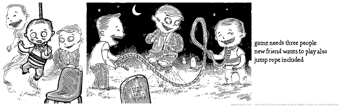
By the way, if you’re new to the strip, the characters from today’s comic first appeared here.
Julie
Sweet! I love friends with benefits.
Becky
Hey Nathan and Bob! IMHO, I think the comic title needs to be a bit larger font and possibly in color because it tends to get lost if you don’t know where to look for it…or maybe space it out from the “HAIKU COMICS” tag do differentiate it better…thanks for bringing back the friends…they are funny!!!
Drew
Let’s hope the boys don’t take a liking to football next! :)
I don’t know that either Bob or I really see the titles as an essential part of the comics, so I wouldn’t put too much stock in them. If you look back at the first few strips, the titles were very generic. If we’re lucky, the titles make the strips a little bit more funny if you take the time to read them — but they are mostly there to make it easier to find strips in the archive.
Which we don’t even have right now. Hrm.
Comments are closed.
WARNING
Haiku Comics often pokes fun at the horror film genre and may contain humorous drawings of nudity and violence not suitable for children or the workplace.

By the way, if you’re new to the strip, the characters from today’s comic first appeared here.
Sweet! I love friends with benefits.
Hey Nathan and Bob! IMHO, I think the comic title needs to be a bit larger font and possibly in color because it tends to get lost if you don’t know where to look for it…or maybe space it out from the “HAIKU COMICS” tag do differentiate it better…thanks for bringing back the friends…they are funny!!!
Let’s hope the boys don’t take a liking to football next! :)
I don’t know that either Bob or I really see the titles as an essential part of the comics, so I wouldn’t put too much stock in them. If you look back at the first few strips, the titles were very generic. If we’re lucky, the titles make the strips a little bit more funny if you take the time to read them — but they are mostly there to make it easier to find strips in the archive.
Which we don’t even have right now. Hrm.